![]()
![]()
![]()
![]()
![]()
|
|
|
Mikhail Viron Internet Section CS 456 Human Computer Interface Final Exam Winter 2002 Answer ALL Questions This is an exam that is designed to test your own
abilities to apply interface design principles. Any form of collaboration will
result in all persons involved being given F’s for the course. I will also
pursue the eviction of those students from this institution. If you must cheat
make very sure that there is no way I will find out. Protect your own work from
others in the class and report any unusual circumstances immediately. ANSWERS ARE DUE BY 9am Thursday 9th May Question 1 (10 points) In a user interface, pictures (icons) can be used since they are not language specific. Does this mean that icons are suitable for any piece of software that is used anywhere in the world? Many icons can be extremely generic and their meaning clear to most users
around the world. Non-software examples of these are icons used in international
airports, traffic signs or a simple “no-smoking “sign. However, in specific
cases cultural factors should be taken into account. For some cultures icons may
not have clear meaning and can be misinterpreted, misleading or offensive.
Example of local differences is the country of Bulgaria where vertical nod of
the head means “no” while in most other countries it means “yes”.
Clearly, an icon depicting a nod can be misleading. Question 2 (10 points) When a movie is being developed, the director will create a “storyboard” that is similar to a comic strip that show the sequence of events in the movie. Storyboarding is a common technique in the movie business. How might you use it in developing a user interface and what advantages and disadvantages might there be? Storyboarding can help a designer to clearly convey his vision for a user
interface to a workgroup and/or management. This will prevent unnecessary work
if design deemed unacceptable from the start. Storyboards could be easily
sketched and then used for initial discussion of the design and corrected before
any major work is done. They can also be user-tested on a limited basis. After
storyboard is discussed and finalized to designer/management satisfaction,
design can be implemented in a straightforward fashion. Since storyboarding is fast and inexpensive there are no major
disadvantages, however user interface is not functional and cannot be fully
tested, meaning further corrections as the process moves along. Question 3 (10 points) Discuss the relative merits of displaying numbers as their actual values or using graphical displays such as bar charts, dials and trend lines. The difference between displaying numbers as actual values and their
graphical representation is the one between precision and readability. While a
group of students in the class may get a better understanding of a concept
looking at a bar chart, a phone company employee (like me) with the voltmeter
will be much safer reading exact voltage of the digital display than looking at
a trend line. Between these extremes there are various combinations of the two,
based on the application of a particular interface. Many examples combining two
representations are seen in the automotive design. While some values are
displayed using dials (speedometer, gas level, temperature), the others (trip
odometer) are shown as the actual values. This reflects the fact that the driver
may not need to know exact amount of gas in the tank, but definitely needs to
know the distance to fill out expense report. Clearly, both value and graphical
representation are important and it is important to know where to apply one or
the other. Question 4 (10 points) Develop a set of guidelines for the use of color in interfaces that would help an undergraduate student use color more effectively in their program interfaces. · Use distinct colors ·
Distinguish display color from
background color. ·
Do not rely completely on color to
relay information. ·
Follow color conventions whenever
possible (Green-go; Red-stop; Yellow-standby) ·
Take into account color perception. ·
Use color with ergonomics in mind.
Some colors cause fatigue, use them with caution. ·
Use color consistently through the
design so the user can identify certain operations with certain colors. Question 5 (10 points) Assuming that you
could not actually see a particular interface design, create a set of ten
questions that you could ask someone who COULD see the interface that would
enable you to decide whether such a user interface was designed properly
according to visual and functional design standards. 1.
When you need to take an action is it clear what to do? 2.
When you take an action does the interface display a change of status? 3.
Do you understand the meaning of all controls? 4.
Would you be able to use controls without memorizing what they do? 5.
Does the design seem logical to you? 6.
Is it aesthetic and pleasant to your eyes? 7.
Is it consistent (same description lead to the same function)? 8.
If action performed in error is there a way to go back/correct it? 9.
What happens when you make an error? Are error messages clear? 10.
Are there shortcuts, accelerators, etc.? Question 6 (25 points) You have been asked to design a user interface for a chain of automotive parts stores. The typical user is a high school drop out who does not stay in the job very long. Currently, a manual system is in place using hard copy catalogs. 1 Using the above information, and your own interpretation, fill in what you believe the typical user characteristics might be
2 From the following seven dialog styles, create a prioritized order of suitability for this application
3
Justify your selections 1.Direct
manipulation interface is probably the most reliable in this case, because the
user will be limited to entering input in a strictly defined manner, preventing
data entry errors. The disadvantage is that when additional information needs to
be entered manually, the user will have to go to a fill-in form interface. 2.Menus
are also very reliable styles of input because the user will have to select from
predefined entries eliminating the possibility of typographic error and
relieving the user of any kind of interpretation responsibilities. 3.Function
keys have similar advantages, however the interface should have a recovery
function in case the user selects a wrong key. 4.Question
& Answer is also an option, assuming that answers are distinct and multiple
choice and should be entered using checkboxes, “radio” buttons and such. All
four methods above have an advantage of eliminating or greatly reducing any
typing done by the user. 5.Fill-in
forms are unavoidable when non-standard information needs to be entered.
However, they leave too much responsibility in the hands of the user and should
be substituted as much as possible be other means of input (scans, etc.). 6.Natural
language option can be either speech recognition or a writing recognition-based.
Speech recognition, although very high-tech, may not be feasible due to a number
of non-native speakers (like me) who can only confuse the interface with
accent/errors. Writing recognition is not much better, because it assumes
correct spelling above the level of high school dropout. However, this option is
better than the next one, because despite its deficiencies it does not allow the
user to harm the system by directly entering commands. 7.
This option is clearly above qualifications listed in the conditions for this
problem. It requires substantial training and with such it may allow malicious
user to damage the system. Question
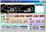
7 (25 points) Using
the following URL for the Automotive Dashboard Gallery select three designs that
you believe best exemplify good visual design practices and three others that
are lacking in good design practice. Provide a detailed critique of each of the
six designs you have selected and refer to them by number. DO NOT SELECT YOUR
OWN DESIGN (good or bad!!!). http://www.bit.umkc.edu/vu/course/cs456/Exercises/Gallery-2/Page1.htm Well
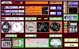
Designed Dashboards
#12 Advantages: Clean uncluttered conventional
design. Provides good contrast and visibility of gauges and lights. Consistent
choice of colors and icons. Gauges and light are logically and aesthetically
arranged. Disadvantages: Map and text display may be
obstructed by steering wheel.
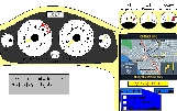
#9 Advantages:
Very clean simple design follows convention for dashboard and, therefore, easily
identifiable. Color combinations provide for good contrast in daylight or at
night. Map is located on the side and will not be obstructed by steering wheel.
Controls are logically arranged. Disadvantages:
Slide with warning lights was not provided but overall design is still
exemplary.
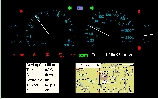
#6 Advantages: Clear uncluttered design. Consistent colors. Gauges visible and clearly marked. Indicators arranged in a logical manner. Color combination is chosen to be visible in various lighting conditions. Disadvantages: Speedometer could be larger. Poorly
Designed Dashboards
#15 Advantages:
This design is one of the closest to the list of functions for dashboard. Disadvantages:
There is no cohesion in the design. It looks more like a collection of gauges
than a single unit. No color coordination or logic in this arrangement. Some
gauges and indicators are not easily identifiable. Speedometer is not standing
out, driver needs to put in some effort to figure out some of the gauges.
Oversized.
#7 Advantages:
None Disadvantages:
This is not a dashboard. Colors will not be visible in daylight or night.
Drop-down menus cannot be used while driver is keeping his hands on the steering
wheel. There is no logic to the arrangement of gauges and selectors. Speedometer
is not readily distinguishable from other gauges.
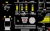
#8 Advantages:
Semi-logical arrangement of controls. Disadvantages:
Too many buttons on the dashboard (I assume those things are buttons). Shifting
gears on the dashboard is not really feasible. Two identical gauges not marked,
so there is no way to find out what they are. Warning lights under large gauges
are not readily visible or identifiable. Cluttered design.
|
| e-mail Mikhail Viron |